By Bajillion Agency
A successful rebrand often follows the story arch of every teenage-coming-of-age movie. The story goes something like this: nerdy guy or girl has aspirations of getting noticed by the popular kids in school, but their appearance and demeanor stand in the way. Inevitably, a wise mentor or an unexpected life event comes about to inject confidence into the protagonist, resulting in a makeover in which the nerdy glasses are replaced with a new wardrobe, a new hairstyle and a more confident voice. The subject of our story gets what they ultimately want, and along the way, the moral of the story is revealed. We find out that our hero had it in them all along. Their new look is nothing more than an external refresh of inner truth.
For the past nine months, Bajillion Agency has been privileged to help the Kansas Bankers Association with their rebrand. The result of the branding process is a more complete telling of the KBA story. Early in our meetings with KBA, the need for a rebrand became apparent. As we learned about the organization, the service it provides to the industry, and its illustrious 133-year history, we knew we had the making of a good brand story.
A Brand Is More Than a Logo
A great way to think about a brand is to compare it to a good friend you run into at an event. The most instantly recognizable asset of your friend is their face (it’s their logo). But if your friend has their back to you in a crowded room, you would still recognize them. Their mannerisms, clothing style, and tone of their voice are all as recognizable to you as their face. Similarly, a brand is everything that makes up its corporate identity. It is the values that your organization espouses, the colors associated with it, the language you use in emails, and the way your employees interact with customers. Our approach to a brand begins by uncovering what we refer to as Simple Truth. The core of every brand should establish two things about the organization; what is unique and what is authentic. These two elements are foundational to everything that follows.
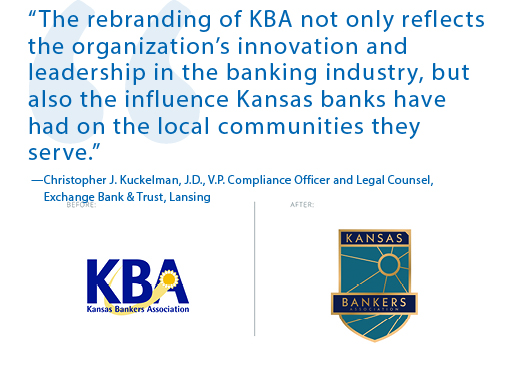
“The rebranding of KBA not only reflects the organization’s innovation and leadership in the banking industry, but also the influence Kansas banks have had on the local communities they serve.”
— Christopher J. Kuckelman, J.D., V.P. Compliance Officer and Legal Counsel, Exchange Bank & Trust, Lansing
Putting the Brand to Words
For the Kansas Bankers Association, several unique characteristics stood out as pillars of their new brand. First, the rich history of the organization, with more than a century of commitment to advancing the banking industry in Kansas. Second, the way the organization responds directly to input from its membership and the level at which membership is involved in the decisions of the organization. The simple truth behind the KBA is that they are banker driven. In getting to know the team at KBA, their passion for the people they serve is the most authentic thing about who they are. This simple truth was the basis of KBA’s brand values.
KBA’s Brand Values
Service — Serving those who have put their trust in us is our greatest honor.
Loyalty — Our allegiance belongs solely to the membership we serve.
Reliability — When called upon, we believe that it is more important to do what we say than to say what we will do.
Resourcefulness — There is always a better way when you combine imagination and hard work.
Adaptability — The needs of our member banks change, so do we.
The exercise to uncover meaningful uniqueness for the association led us to uncover some missing elements in the communications coming from KBA. What KBA does for the banks it serves is very obvious; the missing elements in their communication strategies were explaining to their audience how they do it and — most importantly — why they do it.
This is not an uncommon occurrence among clients we work with. Telling your audience what you do is simple and the most direct way to make a sale or attract a new account. But modern consumers crave a deeper connection with the brands which they choose to associate with. Because of this shift in the mindset of the audiences you speak to, how and why have become just as important in your brand story. One of the greatest effects of making your how and why known is the sense of loyalty it creates among your audience. This doesn’t just include potential customers; employees report a deeper sense of loyalty toward the organization they work for when they are able to articulate the how and why behind their work.
The brand values listed were just the beginning of KBA’s transition from pensive teenager to cool kid. It’s important to note that none of the values listed were new or surprising to anyone in the organization. They were just being articulated with more intentionality. From the values exercise, we turned our attention to the audience that KBA needed to reach — the banks of Kansas. The purpose behind the rebrand was to help better serve Kansas banks, so we established a positioning for the KBA, or reason to believe, that let Kansas banks know why KBA existed and how it achieved its mission. Here is how we position KBA:
KBA’s Reason to Believe: Connecting Connectors
The banks in Kansas connect the fabric of our communities. At the heart of success stories is a bank that was willing to help. The banks of Kansas connect the dreamers and doers of the state with the resources they need to make things happen. The KBA connects their member banks with the resources and network they need to remain an essential part of the lives of the communities they serve.
With a firm understanding of who KBA is and how they improve the lives of those they serve, the Bajillion design team went to work to establish a visual look that put the brand’s values on full display.
“Our new brand is not an outcome; it is a happening. We look forward to seeing the positive impact this will have for our Kansas banks and the communities in which they serve.”
— Mary Taylor, Senior Vice President, Communications and Marketing, Kansas Bankers Association
The Look
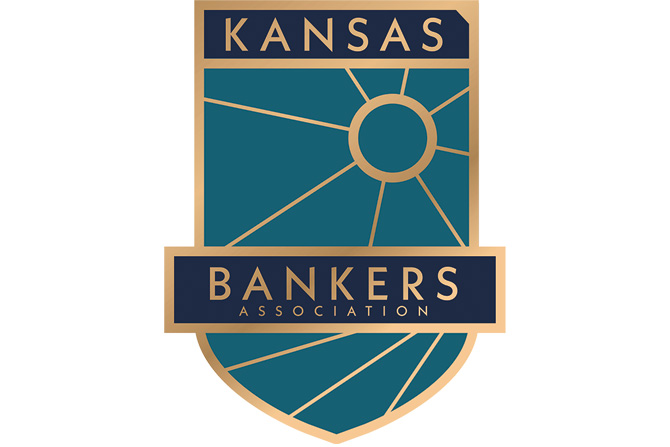
To create the visual representation of Kansas Bankers Association, we began with the most striking and unique feature of the association: its history. With 133 years of operation, the Kansas Bankers Association’s service has spanned the 19th, 20th and 21st centuries. We wanted to honor that rich tradition by creating a brand that showed the heraldry of more than a century of service but drew inspiration from Kansas, the state that made it possible.
Our design story begins with a modern take on the coat of arms. Coats of arms were among the original forms of design — they were the first brands. The crest that serves as the foundation of the new mark is built using the familiar shape of Kansas combined with the inspiration brought about by the famed Kansas sunsets. The elements denote, in a simple fashion, the organization’s location and its mission. In the same manner that the light reaches all corners of Kansas, so does the Kansas Bankers Association.
The color palette for the brand is anchored in rich blues. In color psychology, blues elicit feelings of trust and dependability. The palette is accented with a gold-tone that denotes the nobility and professionalism of the organization. In total execution, the mark feels like it has been a part of the organization from the beginning, yet it is steeped in the modern story of the Kansas Bankers Association. The new Kansas Bankers Association brand portrays the authority and approachability of the organization with elegance. It is a mark 133 years in the making and is ready for the next century.
Bajillion Agency
This story appears in Issue 5 2020 of The Kansas Banker Magazine.